Most of Florence's music videos follow the same sort of patterns. They are all quirky and of a different nature to a convential music video.
The first video I am going to analyse is Florence and the Machine - 'Dog Days Are Over'. http://video.google.co.uk/videosearch?q=florence+and+the+machine&hl=en&emb=0&aq=f#q=florence+and+the+machine&hl=en&emb=0&aq=f&qvid=florence+and+the+machine&vid=4353557976784344908
The start of this video is abit disorientated, and you are not quite sure of where you are. The use of bright coloured streamers and clothing etc, is a technique which we are going to use in our video as we think it goes well with the quirkeness of the group.
This video has given us an insight into the stlye which Florence likes to use and how she likes to represent herself, so we will try to stay along the same lines as these videos.
The second video I am going to analyse is Florence and the Machine - 'Drumming Song'.
http://www.youtube.com/watch?v=boo2Zm69fhY
This video has a slightly more modern feel to it, but with gothic like clothing. It would seem that the vidoe is set in a church, also at the start of the video Florence is dressed in head to toe clothing whilst praying whcih would also fit in with the church theme.
I have not really got any inspiration from this video as the concept is different to what i want to achieve with my video, but i did find it usefull in seeing the style in which Florence and the Machine like to work with, and how they like to be portrayed.
Thursday, 10 December 2009
Thursday, 19 November 2009
Analysis of 2 Digipak covers
 This is a digipak cover of the band 'Foo Fighters' for their album 'Skin and Bones'. It was released in 2006.
They have used relatively dark colours which suggests the genre of music that they perform, may be of a rock or heavy metal genre, but in contrast there is a section in the middle if the front page which is bright orange, which could then suggest that they are trying soemthing new or breaking through into the unknown.
With it being bright orange it attracts you to look at the centre if the page because it stands out. This in turn brings your attention to the name of the song and the title of the DVD.
When you look closer at the cover you can make out that the picture of is the 'Foo Fighters' playing on stage and a large crowd in front of them. It may have been done like this to show that they have a large fan base as this looks like a still image from a live show. It may even be a still image from a section of the DVD. By putting this image on the front it gives you a feel of the energy that the band ejects. The images on the back cover are of the four members of the band and there are the song titles and some smaller images of the venue which they are playing in. There is also a box of text which lists the names of the songs in order that they appear. Also there are various boxes of images related to the front page.
The font used on the front cover is block writing and is easy to read so it makes it clear the name of the band and name of the DVD. Behind the name of the back is a stave, which you would put musical notes on. This show that they produce music. The choice of black for the font fits in with the colour theme for the rest of the DVD cover. The same writing with the lettering on top of a stave has been used on the side of the DVD cover as well. There is nothing particularly special about the font, it just just block capitals which makes it easier to read so there is no fuss about not knowing what it says.
The words that they have used can be used to reflect the personality and style of the band. For instance the album title is 'Skin + Bones', this suggests that there may be a darker side to this band and this can tell us about the type of music which they play. I doubt from looking at the DVD cover that they would be singing about happy topics but more about deep meanings and horror etc.
The composition of the cover focuses mainly on the front cover which shows the band playing to a live audience which suggests that the DVD is about this performance. Obviously the song names and list are placed on the back of the cover, which is customary to any music disc cover.

This is a Digipak cover for No Doubt's album 'Tragic Kingdom'. It was released in 1995.
The colour scheme used in this digipak is very 1960's when colour was just starting to be used in print and TV. It almost has a grainy effect to it which shows that it is meant to be in an older style. The colours are not particularly bright but rather dull, this is showing that technology may not have been as advanced in the period that they are trying to portray.
The image on the front cover of this CD cover is of the members of the band and the main singer. The composition of the cover is showing that the woman is the more important figure out of the group as she is shown in a more important role because she is the main figure on the cover. She stands in the centre of the back cover showing that she has dominance over the other band members, and also on the front cover she stands out of the circular, which is showing that she is more important the the other band members because they want you to notice her. We can tell that these people are in band because they are each carrying their own instruments, which is showing us the role in which they play in the group. In the corner of the front cover there is images of mouldy oranges and flies, this is in relation to the album title 'Tragic Kingdom'. With it being a 'Tragic Kingdom' it suggest that's bad things happen in the place that they are talking about, so there for things like food being ruined is a tragic thing as people need food for survival. Also flies are seen as a bad thing because they spread dieases.
The word choice of 'Tragic Kingdom' is related to some of the songs on the album, including the song called Tragic Kingdom. This is relevant to the vibe which you get from some of the songs, which i mean you get a certain mood from different songs on the album, some are abit more of the rock and roll genre compared to others leaning more towards the pop side of music.
6/12/2009 19.12
Thursday, 12 November 2009
DVD Digipacks

This is an image of a Digipack. I am going to be creating a digipack to compliment my music video. The CD cover will be on Florence + The machine and will be advertising their song of which we are making a video of. Each of the three people in our group will all be creating our own digipack. This is a chance to show our own creativity and our own ideas.
Wikepedia gave this definition of a Digipack: 'Digipak is a patented style of compact disc or DVD packaging, and is a registered trademark of AGI Media, a MeadWestvaco, Inc. resource, which acquired the original trademark holder, IMPAC Group, Inc., in 2000. MeadWestvaco licensed the name and designs to manufacturers around the world.
The digipack is only a section of our project, which will eventually form part of my promo pack for my music video.
The idea of a promo pack is to support the ideas and style which are presented in the video so it is therefore a print version back up to the video.
09.11 19/11/2009
Thursday, 1 October 2009
Research, Mise-en-Scene and Locations
.jpg)
.jpg)
These are the picture of the two possible girls we are going to use in our music video. Both girls are willing to particpate in the video but we are undecided which one would be best suited for the role. We think both girls have good looks but we are unsure which look will be best for our video. We would however be happy to use either of the girls here, but it will depend on the day of filming as to which one is avaible.
We have two locations for our project, which are, on Eastbourne beach and a small woodland area in Lewes. I have been out to take pictures of each of these locations, which i then used to put in the anamiatic which is a digital storyboard of our music video.
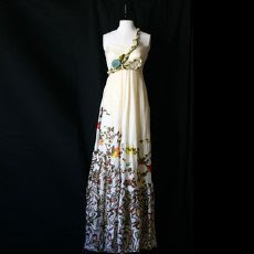
For the costume we are planning to have a 1920's flapper dress for the black and white section of the video, this is so it is fitting with the era which we are trying to achieve. Also this is the style that we have decided, from our research, is best suited to the band and the type of music that they play. The video will be mostly black and white apart from the chorus. In the chorus we are going to bring the video back into a modern day, which will see Florence wearing the bohemian style clohes which she is known for.We intend the girl to have subtle yet effective make-up so it will look as if she is made up but not in a tarty way. I think bright lipstick will go well with the costume. This is the type of dress which we want to use for the black and white scenes in our video, but maybe with the dress abit shorter.

We also want the dress to look be flowing to give a better effect and to create a sort of spaced out, almost drugged effect, this is the type of dress we are going to use in the scenes in the forest. I think it while go well with the effect that we are trying to achieve. Also we would like the dress to have some bright colours to add effect, but again this all depends on the budget of what we can spend on extras.
For the colour scenes we want to show abit of Florence's real style so we are going to use inspiration fron her own wardrobe to style our girl for the video. We want the dress to have a simple design as we don not need her to be to bold in these scenes. I think a plain beige short dress would suit this scene best because it is keeping Florence natural looking, and there is no mention of craziness in second half of the song so there is no need for her to be wild looking.

We have two locations for our project, which are, on Eastbourne beach and a small woodland area in Lewes. I have been out to take pictures of each of these locations, which i then used to put in the anamiatic which is a digital storyboard of our music video.
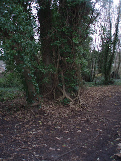
These are pictures from the location of the small forest, that I took. We have decided to shoot here because we thought it was a good location for the feel we are trying to achieve. We want to achieve a feeling of insomnia. We are going to paint some leaves bright colours, and have Florence prancing around the forest, looking lost. Also in this small woodland area there is a large pond, which i think could lok really effective if we are able to shot on a sunny day because we can use the reflections and brightness for the pond to create a more spaced out effect.


These are the pictures which I went and took on Eastbourne beach, which is our second location. We wanted to shoot here because to go with the song title 'Swimming', i felt we needed to have a location near the sea. The atmosphere of the beach in Eastbourne is very traditional. The beach has an old fashioned pier, which was built in 1870, though it looks like something out of the 1920's, and the old wooden groynes add to the old fashion feel. We also needed to all be able to get to the location easily, and this beach provided that for us. Other options which we could have used were the beaches in Hastings or in Seaford. Owing to the fact we are filming in winter means that the beaches and quiet and not to busy which makes it easy for filming.


I have decided to have a contrast between the 1920s and modern day because i felt it gave the video abit more edge instead of it all being set in one period. The aim is to get the video looking like half set in the 1920's and half in modern times. Whether this will be possible once we start editing is something we will have to deal with. Hopefully we will be able to get the effects we are after.
Thursday, 24 September 2009
Brainstorming
We have chosen the song 'Swimming' by Florence + The Machine. We decided to choose this song because we knew we wanted a song from within the genre of Indie. We decided on this song because the ideas we had for a music video fitted in well with this song.
 This is the email which we wrote to the record company (Island Universal Records), to ask for permission to use their song for our music video. We wanted to seek copyright permission so we therefore knew that we were not copying anyone elses work etc.
These are the song lyrics to the song 'Swimming' by 'Florence and the Machine'.
Your songs remind me of swimming,
Which I forgot when I started to sink
Drank further away from the shore,
And deeper into the drink
Sat on the bottom of the ocean,
A stern and stubborn rock
Cos your songs remind me of swimming,
But somehow I forgot
I was sinking, now I'm sunk
And I was drinking, now I'm drunk
I was sinking, now I'm sunk,
And I was drinking, now I'm drunk
I tried to remember the chorus,
I can't remember the verse
Cos that song that sent me swimming,
Is now the life jacket that burst
Rotting like a wreck on the ocean floor,
Sinking like a siren that can't swim no more
Your songs remind me of swimming,
But I can't swim any more
Then all of a sudden, I heard a note,
It started in my chest and ended in my throat
Then I realised I was swimming,
And then I realised I was swimming,
And then I realised I was swimming,
And then I realised I was swimming
Pull me out the water, cold and blue,
I open my eyes and I see that it's you,
So I dive straight back in the ocean
Take a deep breath, tuck the water in my chest
Cross my fingers and hope for the best
Oh, take a deep breath, tuck the water in my chest,
Cross my fingers and hope for the best
Then all of a sudden, I heard a note,
It started in my chest and ended in my throat
And then I realised I was swimming,
And then I realised I was swimming,
And then I realised I was swimming,
And then I realised I was swimming
My current ideas on the music video are to have an old fashion 1920's theme. The colour used are going to be primarily black and white, which compliments the old fashion theme. However we are going to have some colour scenes to help keep a modern feeling to the video.
The setting is planned to be on Eastbourne beach. I chose this because of the song title being 'Swimming' i thought a water front setting was fitting. As for costume we are planning to have 1920s 'Flapper Dresses' for the black and white parts of the video and bohemian style outfits for the modern day sections because this style of dress goes with the style of music.
 This is a picture i took of the beach which we are goin to use to film some of our music video.
http://www.youtube.com/watch?v=FR-Q52njXiI For the modern section of the video to have something like the Florence + the Machine video to 'Kiss with a Fist'. I am going to take some of my inspiration from this video because i think it represents the style of video i want well.
http://www.youtube.com/watch?v=B9tXxO5fYfo&NR=1 This video of 'Rabbit Heart' is simialar to hiw i imangine my music video to turn out because i like the airy feeling i get from the video and the costumes and simialr to the one i want for the black and white sections of the video.
We all plan to take equal parts in the video production. However if one of us has a better talent in one area of productiuon then they would take a leading role in that area.
I as yet have no ideas about my promo pack. I have to design a DVD cover and advertisment to go with it.
https://docs.google.com/fileview?id=0B3KX54JYsqzRYTlhOTIxZDUtYzM2OS00NWJlLWEzMmEtZTg4OWM3NDczNzJk&hl=en This is a link in which my group made a presentation to show our ideas and some images to display our music video. We have filmed ourselves talking about this presentation so you can get an idea of our views on our ideas.
24/09/09 10.05am
This is the pitch in which we spoke about how we came up with our ideas for our music video and how our ideas devloped into a usuable product for us to make our video with.
Subscribe to:
Comments (Atom)