Tuesday 30 March 2010

Anaylsis of two adverts


This is an advert for the band 'Blacktop Mourning', advertising the album No Regret.


The colours used in the advert are primarily dark but it is as if there is a breakthrough of light in the centre of the top. This is as if they are spying through into a better world. It could be seen as you shouldn't regret anything so move forward as better things lies ahead. The element of the sunshine shows that there is some sort of happiness in this new place.


The font is very blunt and straight, suggesting that this is a serious album not one to listen to for a laugh but that the songs have a message to give out. The colours of the font are also very clear and stand out from the background very well. It is a very non-fussy album cover.


The image of the tree, deer and small girl could suggest something that is in one of the songs or maybe the theme of the album.


For my second analysis of an advert i have decided to analysis this one of Florence and the Machine advertising her new song 'Drumming Song'


The font used on this advert is typical of that found on all things related to Florence and the Machine, as this is her signature font, as soon as you see it you relate it to her.


The image is of Florence relaxing next to a drum, which of course is the relation to the song 'Drumming song'. So i think the composition of this advert is very effective in drawing your attention to the items in the images. The relaxed position of Florence in this picture suggest that the music is quite laid back. Also the use if items in this advert gives clues to the type of music which this is going to be.


The colours are very natural, there is nothing bright to make the image stand out as it would not go with the tone of the advert. You could also relate the subtle colours used to how the music will be, for example if a cover has dark and depressing colours it could suggest that the music is very solemn and sad, whereas from the colours of this advert we can interpret that the music is relaxed and chilled.

Final Digipak and Advert

Front cover
First inside cover

Second inside cover

Back cover


Advert

Monday 29 March 2010

The Final Video

http://www.youtube.com/watch?v=ZLoqw86a32o


This is the Final Video for my coursework. The song is by Florence and the Machine and is called Swimming. I have had to put in a Youtube link because it would not allow me to upload the video.

Thursday 25 March 2010

Editing

We have taken five weeks of our schedule to edit our Music Video. I feel this gave us enough time to edit our footage successfully and with a positive end result. Our previous planning throughout the year, along with our animatic and storyboards allowed us to edit our filmed footage relatively easily as we knew the basic structure of our video.

I started of by capturing back our footage of the tape in the Camera and onto the Apple Mac which I were using to edit our footage. The program I used is called 'Final Cut Pro', this is editing software which allowed us to cut, crop and use special effects on my clips of footage. Once I had my footage captured onto the Mac I then separated it into 'Testing Footage, 'Beach Location Footage' and 'Woodland Location Footage'. By doing this it allowed me to be able to find the piece of footage i was looking for easily. This in turn made editing a lot easier.

Once I had all our footage on the Mac and saved in the folders I could then start getting a basic layout of footage onto my timeline. I had uploaded the song so I could place certain pieces of the video to certain beats of the song to give the video a bit more structure which made it look more realistic. By getting a basic order of all my footage onto the timeline it allowed me to be able to then go back and add in other effects and clips once i had the main order. This worked well because it let me be able to keep an order to all the footage that i was using.

When I had placed all the basic sequence of footage onto the timeline I was then able to add effects like quick cuts and fades into the sequence.

Effects, Techniques and Fades.

The first 0.00 - 0.06 seconds of the video have been designated to quick shots, I chose to do this because it allowed the video to establish its opening set. The shots consist of some painted leaves, the actress and the book which is called 'Swimming' therefore which directly links to the song title. By doing this we know in the first 6 seconds that it is set in a leafy area and the video is going to contain a girl in a black flowery dress. I think this is a good establishing opening.

At 0.06 - 0.08 of the video I have used my first fade to black and out again to go from one view into a close up shot of her face singing. i think it was right to use a fade her as a quick shot from panning up her body to then be directly on her face didn't look right, so it was necessary to put a fade in here.

0.33 - 0.35, here I have another fade to black and back again because the footage which we shot did not fit in right with how we wanted to edit it. In the footage I had she was in two different sections of the woodland area, so by adding a fade we were able to make it seem as if time had passed whilst she was walking from one section to the other as the fade ends with her still walking.

0.43 - 0.44, another fade is used here because once again she is in two different positions and these were not the positions that would allow the video to go smoothly, so I put in a fade to allow us to be able to use the footage which I had already. The outcome in my opinion was successful because I were able to end one scene of the woodland and carry on smoothly into the next scene.

1.35 - 1.37 is this clip of the video I have used a bright white fade in contrast the the black fades which i have previously used. I think this works really well in this scene because the brightness of the sun behind her as she is walking down the steps allows us to be able to use this bright fade.

2.19 -2.26, in this 7 seconds of footage we have used quick cuts on the beat and when the song plays the words 'And then I realised'. We have cut the footage to get closer on each of the three beats, starting from a long shot then a closer shot but still and long shot and then ending with a mid-shot of her singing the words to the song. I think this is effective because it adds a bit of variety into the shots which we are using.

2.30 - 3.02. In this section of footage we have added in a 3 second shot which changes the position of the actress when the songs plays 'Your song reminds me of swimming', the shot plays overriding shot plays whilst this bit song is being sung and then returns to the previous footage. This happens three times, I did this because it is quite a long section of footage and I felt it needed a bit of variety so by adding the same shot in when the same line was sung it gave the scene a bit if variety and stops the scene looking so static.

3.02 - 3.11. In this last section of the video I wanted to create something a bit more dramatic to end with. So i did this by adding in two shots per second for 9 seconds. The shots that I used are in reverse order of the video itself. In effective it is showing her journey through the video. I think this is effective because it adds a bit of edge and dramatises the video. You could say that it leaves it going out with a bang.

I end the video with a high angleshot of the actress laying down next to the book with 'Swimming' written on it. This is therfore relating the ending to the beginning of the video as we see her reading the same book at the start.

In conclusion I think all the effects and techniques i used were effective in creating the right view of the video that i wanted to achieve. I feel that the effects have improved sections of my video by allowing me to use certain footage which i may not have been able to use if the editing and effects were not avaible.

Thursday 11 March 2010

Storyboards and Animatic

Here are the storyboards which we drew up for our music video. We tired to follow to these as much as possible because we felt we had some good ideas on them which we wanted to incorporate into our video. Also by working out the timings and what our actress would be doing in advance and placing it onto the storyboard, it allowed our filming to be much smoother as we were n0t constantly trying to figure out what she should be doing in each scene. Also with writing the seconds for each scene we were able to accurately film most scenes to how long we needed them for.


This is the anamitic which we created to help us map out our ideas digitally to alow us to have a better idea of how each scene would look with certain views. This helped us when we were creating our final piece as we could see how long we needed in each location depending on the beats of the song.

Evaluation

Audience Feedback


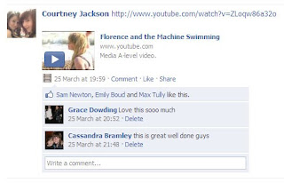
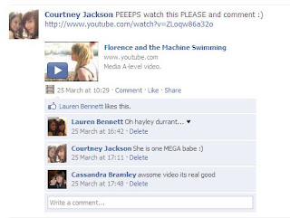
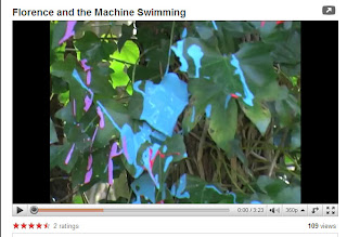
I posted my video on Youtube due to Facebook not letting me upload the video because it was in the wrong format. However once having put it on Youtube I placed a link in my status on Facebook. Above are two images of the comments that people have left regarding my video, the image below is of the video on Youtube, in 3 days it received 109 views and had a rating of 4.5. All the feedback that I have received from people watching the video has been positive, i have had no negative comments. People have commented to me about how well the girl in my video performed and that she was as good as the real Florence.

If i was to change anything about my video due to the feedback that i have received from my target audience viewers, it would be to have the actress wearing shoes as sometimes it looks like she is in a bit of pain due to the sharp stones on the beach. This was the only negative comment I received.
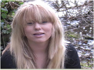
The link above takes you to a video which i filmed of a girl in the age bracket for my target audience talking about what she enjoyed about the video and how she thinks it could be improved. Although we did receive all positive comments back from posting the video on Facebook and Youtube, the comments were not in enough detail for us to gauge a real perspective of what people thought, also we wanted to hear some constructive criticism. This is why i filmed this interview.

Developing and changing forms and conventions


In my music video I have taken inspiration from other Florence and the Machine videos because i wanted my video to be a realistic and as much of an accurate representation of Florence as possible. Here are photos of some of the similar shots/angles that I have developed from real media products.


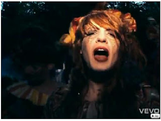
I think my media product has a accurate likeness to that of existing Florence and the machine media products because i have tried to keep the same themes running in my video as in hers. The photos above are a comparison between a still shot from my media product and one of a real media product, you can see that i have tried to take inspiration from some of the angles and shots in real media products and put them into my product. By doing this i have hoped that i have created an accurate and believable Media product for Florence and the Machine.

In previous Florence and the Machine videos there seems to be a running theme that it is as if she is slightly spaced out and she is in a dream world. This is what i have tried to create in my video. I wanted my actress to seem as if she was unsure and curious as to where she was and what she was doing there but all the while continuing to sing the song.


In real media products the singer in most cases will be singing/miming to the song whilst being filmed, this is something that i wanted in my video. I wanted the actress to be miming along to the song as i felt this made it a bit more realistic otherwise i did not think it would be believable as a music video.
As for the set and the location i looked at different Florence and the Machine media products to take inspiration from what sort of set that they used. For the beginning of my video i took ideas from the video of 'Dog days are over'. The theme at the start of the video is a carnival theme which uses a lot of bright colours and this is something that i wanted to incorporate into my video. So i decided to use bright paint to cover some of the trees and leaves in the woodland location that i was using, i think this allows the media product to be related to other Florence media products as they both have bright beginnings.


The first photo here is off the bright coloured paint which i used for the trees, the second is of the beginning carnival scene of 'Dog days are over'. This is the scene which i took inspiration from.

I also thought i would do something different in the video, and film it by the sea. I have not seen any media products for Florence and the Machine, filmed by the sea. Also filming by the sea created a direct link between the title of the song ('Swimming') and the location of the video.

However something i decided to do differently was only using one person in the video. Real media products of Florence and the Machine are usually filled with people, all playing a part in the narrative of the video. I decided to only use one person due to a practical element and also it made sure the focus was on the only character which is what the video was all about.

Connections between Promo Pack and Main product.
I have tried hard to make sure that there is an obvious link between my video and my Promo pack, i think i have achieved this
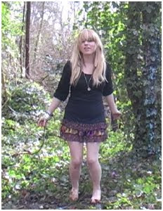
At the time of filming i took pictures of my actress in each of the locations and i used these photos as the images on my Promo pack. I did this to make sure that the settings and actress were the same and dressed the same which therefore gave a stronger link between the promo pack and the music video.

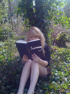
Here are two images. The first is an image which i took a picture of and used and the central image for my advert. The second image is a still shot taken from the video. You can see that she looks identical in both photos apart from the position she is standing in. This is what i wanted, so then people would therefore be able to relate one to the other.
The main link between my Promo pack and my music video is that i used the same girl, clothes and style of make-up. I think this helps establish a strong link between both of them. I also tried to keep a theme running through the video and the promo pack of bright colours. I used paint in the video and on the promo pack i created a flower border which i put on each page and coloured each one in a different bright colour.

Use of technology
Final cut pro

This is the software which i used to edit my footage and make it into a video. We used this software on a Apple Mac laptop. This software allowed me to capture back all my footage and separate it into easily accessible folders. I had folders which contained footage from each of the locations that i used (e.g.'Beach Location' and 'Woodland Location'). This allowed me to easily edit the footage in the folders for each section of the video which i needed them to be in. I placed the clips of footage along a timeline which was synced with the song so i could get the shots in time with the beat of the music.

Adobe Photoshop
I used photoshop as an aide to creating my Promo Pack. It allowed me to be able to edit the images that i had taken and make them appropriate for my advert ad digipak. Without Photoshop i would not have been able to change the brightness/contrast etc of my images and they would not have been as effective on the advert and digipak.


Adobe In Design
In Design is the programme in which i created my Advert and Digipak. This programme was really good in allowing me to edit images and for putting things in the right order. It also allowed me to place things exactly where i wanted them to be to let me be able to create the best products that i could.


Internet
The Internet was the most vital tool to being able to research and create this product. Without the Internet i would not have been able to research and plan any of what i needed to. I used the Internet to watch other media products created for Florence and the Machine, this allowed me to see what sort of style and composition of video that they liked to use, it also let me see what sort of clothes and make-up which they used. These all helped me in designing, and planning my own media products.

Microsoft Office PowerPoint 2007
In the planning stages of my product, PowerPoint allowed me to create presentations to show people what i planned to create. I was then able to get feedback and improve my product in the planning stages. I have posted a video of me presenting a PowerPoint to an audience previously on this blog.

Evaluation of Camera work


When filming i tried to use as many shots as i could, this was to enable me as much variety as i could possible have. I think i Incorporated enough shot to be satisfied with, i got a establishing shot in at the beach and a few long shots and close ups as well. At the end of the video i even put in a high angle shot of the actress to add a bit more variety.

To make the filming/footage as smooth as possible we have the camera mounted onto a Tripod. I chose to do this because with the nature of the video there did not need to be any shaky hand held camera shots. Also we zoomed in at some points of thew video and if we had handheld the camera it would have made the shots really shaky, and ruined the footage. When setting up the camera we unfolded and extended the three legs to have it a suitable height for what we were filming at the time. We then firming attached the camera to the top making sure it was secure. When filming our high angle shot we extended all the legs out as long as they would go and used the arm on the side of the tripod to direct the camera downwards.

When moving the camera we made sure that it was going to look how we wanted it to look in the video. For example in the scene where she discovers the beach we have a slow pan to the right following her as she is walking towards the gap. The slow pan makes the camera look really smooth and in control. We used a zoom in some places to save on having to keep changing shots, this also allowed us to have longer shots.

We played around with the camera settings each time that we moved location due to some places being brighter than others. One instant where we had to drastically change the aperture and shutter speed was when we were filming s low angle shot of her walking down the stairs. The light behind her is bright white due to the sun so we had to change the settings to allow the camera to be able to see and film her. We also had to brighten some of the shots in the woodland location as the trees overhead restricted some of the natural light.
We chose not to use a clapperboard as we thought we would not need to do may takes of each shot, which proved to be right. At the most we filmed a shot three times and it was obvious in our footage which takes were which and also at the time of filming we wrote down which were the best shots so we knew in advance when looking through our footage which we wanted to use. We followed our storyboard accurately, this is what allowed us to have all our footage in order so when putting the footage onto the Final Cut software we did not have to mess around trying to get it in order, we just easily extracted clips. We filmed over three separate shoots, which we had planned in advance so we all knew where we had to be and when, which made things smoother as there was no messing around with time etc.
When it came to filming and directing we both put our input into each area but we both took of a stronger role of each one. My main role was directing, i was in charge of getting the actress to do the right things that we wanted for the video and making sure the camera was where is needed to be, whereas Deliah was responsible for actually filming the video. However if we had different views to what the other was doing we would put our input in and work together to form a better shot.

Thursday 11 February 2010

Filming

We have faced many obstacles when filming regarding the girl who was meant to appear in our film and one of the members of our group not attending when we had made plans to film. We ended up starting filming very late into the year which has left us with not much time to film the entire video and edit the outcomes.

In the end me and Deliah decided to continue on our own and went out the the camera to practice depth of field and other techniques at one of our locations. The camera which we used was a Canon XM2. When practising depth of field we were changing the shutter speed, apperture and video gain to darken and lighten to shots. This put us in a better position for when we started filming as we were already familiar with the techniques which we were going to use. We also went out to look at possible sections of the woodland area which were most suitable for what we wanted to have in our video.


The first lot of filming we did went well considering the weather conditions which we had to film in which was freezing cold, but then we had another set back when the girl we were using decided to pull out, leaving us once again without anyone to film. Therefore this footage became useless to us. Then one of my friends agreed to be in the video.

5Th February: We started the first lot of filming on this day with the girl who is going to be in the rest of the video. In the shoot we were able to get the scenes of the first location shot. We now just need to go back once more to add a small section into the sequence of scenes. We are now in the position of being able to edit this section of footage. Phoebe was not present at this shoot so me and Deliah continued without her so we did not fall behind even further. To make the set look how we wanted to we painted some leaves of trees and on the ground to give the location better look.


On 19Th February, myself and Lilah went to our second location, which is Eastbourne Beach, and filmed the remainder of our music video. We used various parts of the beach to create the atmosphere and to give of the right vibe which we wanted to achieve. I had previously written in my blog about using a 1920's dress on our actress, this proved unachievable due to cost, so instead i used one of my own, which we both felt gave us a successful result. The dress was a plain beige knee length dress, which in my opioion worked very well in the enviroment in which we were filming. We decided that it worked best if i took the role as Director and Lilah took the role of filming. this worked really well for us because we were both able to contribute our ideas for how we wanted it to look but then both of us having our own area to concentrate on and put our effort into. This led to the overall result being very successfull.
We completed filming on this day which then allowed us 5 weeks to be able to edit our footage into a music video.

Here are pictures of the two dresses which i spoke about above.

Wednesday 20 January 2010

Flat Plans


These two images here are the first draft of my flat plans for my digipak. I have decided not to use these plans because i do not think they have enough of a relation to the music video for people to be able to link them together. I need to put in more pictures taken whilst filming.

Here are the second designs i have done for my flat plans. I have also chosen not to use these because again i feel that the layout in not adequate to what i want to achieve, as yet again i have not left enough spaces for effective images, the images which i Had planned to put in this flat plan is not enough to be able to relate Digipak to music video.


This is my third design for my digipak. I have chosen to use this flat plan because i think it puts across the ideas and feelings i want to achieve best. This flat plan allows me to have the images of the beach and woodland area along with images of Florence which i had taken whilst filming, so this therefore has a strong link between the video and Digipak.


This is the first flat plan i designed for my advert. i decided against using this one because i thought that the position of the boxes and texts didn't give the image its full potential. I wanted the image to be the focus point of the advert and this flat plan does not allow this.


This is the flat plan that my original design was based on but i have since altered my advert so it is no longer similar to this plan. I wanted to use this originally because i felt it gave the image credit and allowed it to be the main point of the page with the other texts and boxes being to the side.


This final desing was not practical when it came to producing my advert as having the text down the side and along the bottom did not go nicely against the image behind. Therfore i did not use this flat plan as i deemed it unpractical. Also with the text box image in the corner it drew attention away from the central image.